See the lease, not just the rows: why we built the payment schedule chart
If you have ever stared at a 60-row amortization printout and still walked away unsure why the deal feels expensive in year one, you are not alone.
Tables are the truth layer. They are also a wall of numbers. For commercial equipment leasing, where steps, skips, balloons, and odd day-count months show up in the same conversation, a table can hide the story in plain sight.
That is why LeaseIQ Pro includes a Schedule chart right next to the classic Payment schedule table.
What it looks like in the product
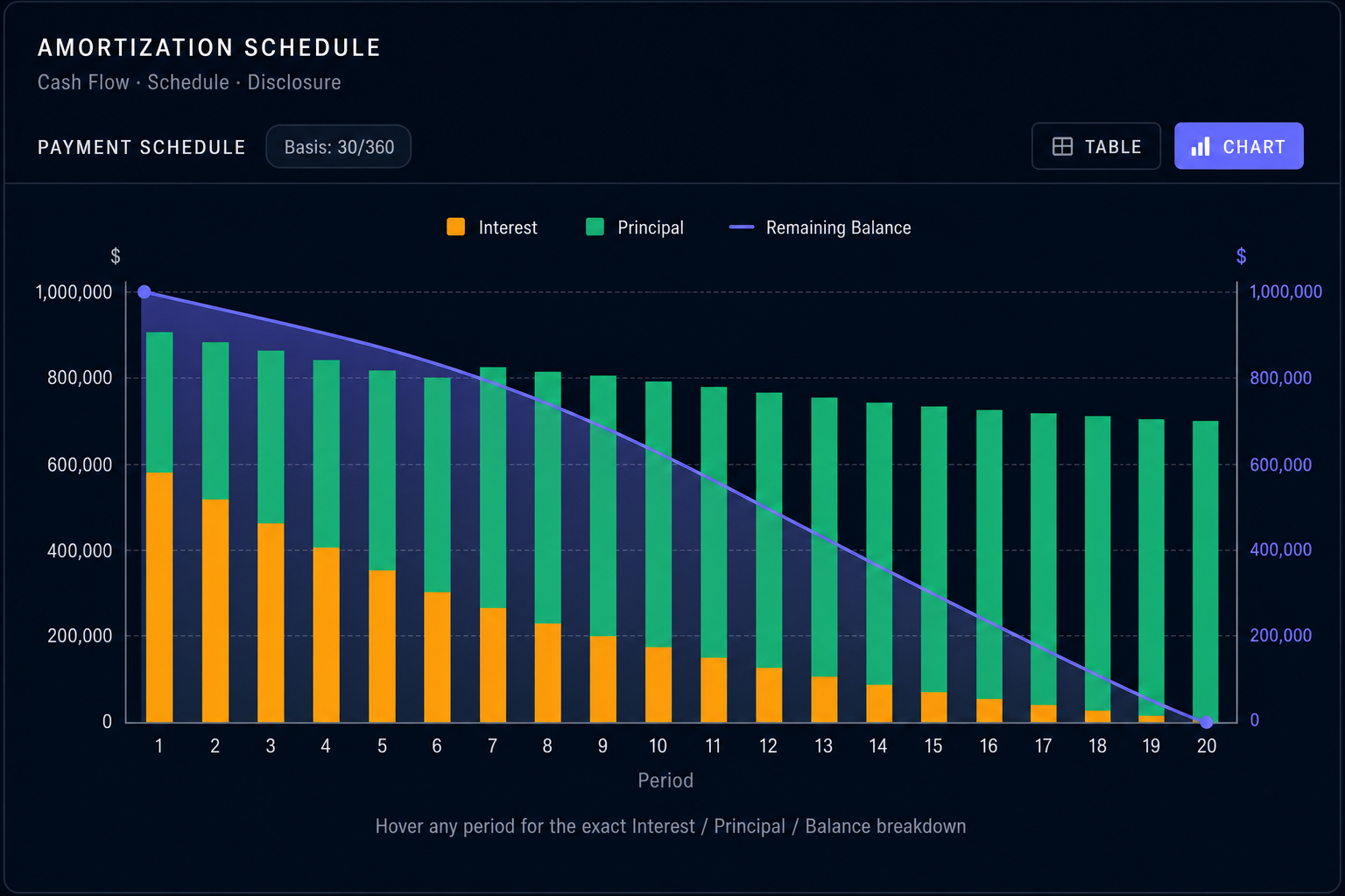
In the Amortization schedule block, use the Table / Chart toggle and choose Chart. You get stacked interest and principal by period, plus a remaining balance curve on its own scale, with hover readouts for exact dollars.
What the chart actually shows
The chart is built from the same schedule math as the table:
- Stacked bars for each period: interest and principal add up to the payment shape for that period.
- A remaining balance curve layered on its own scale so you can see how exposure declines over time.
Hover a period and you get the exact interest, principal, and balance for that period. No guessing from bar height alone.
The chart uses the full schedule, not a short preview. Long deals automatically thin the tick marks on the axis so the graphic stays readable.
Why brokers told us this matters
1. Irregular deals stop looking "normal."
On a vanilla level-pay lease, the table is boring in a good way: every row looks like the last one. The moment you add steps, skips, or a balloon, the important question becomes: where does cash flow bend? where does principal catch up?
A chart makes those bends obvious. Your eye finds the inflection faster than your finger scrolling.
2. Interest vs principal becomes a conversation, not a lecture.
Clients do not live in spreadsheets. Stacked bars make a simple point intuitive: early in the lease, interest often carries more of the visual weight; later, principal does more of the work. You can explain effective cost and paydown without sounding like you are reading a textbook.
3. Balance is the credit story.
The balance line answers the question a credit-minded buyer quietly asks: what is still outstanding after year one? year three? The table contains the same numbers, but the curve answers the question in one pass.
Compared to a typical amortization table
| Tables | Schedule chart |
|---|---|
| Perfect for audit trails and line-by-line proof | Perfect for pattern recognition and client-facing explanation |
| Easy to get lost in 48 to 84 rows | Shows the whole term at once |
| Great when you already know what you are looking for | Great when you are asking "does this structure look sane?" |
| Often exported as PDF or Excel and treated as static | Stays live with the deal: change a structure input, the picture updates |
Nothing here replaces the table. The table is still where you prove the work. The chart is where you see the work.
A small detail that reflects real-world math
Some schedules include periods where accounting lines get weird (for example, capitalized deferrals can create negative principal splits in raw data). The chart is tuned so those edge cases do not break the visual or pretend the impossible is happening. You still get a trustworthy picture of payment composition and balance.
When to use which
- Use the table when you need dates, year totals, export to Excel / CSV / PDF, or disclosure-grade line items.
- Use the chart when you are structuring, negotiating, or presenting, and you want the other person to nod because they understood, not because they gave up reading.
If your job is the deal in the field, not just the desk after the fact, the schedule chart is the fastest bridge between "trust the math" and "see the math."
LeaseIQ Pro is built for independent commercial lease originators who need serious structure without spreadsheet surgery.
Seven-day trial. Structure from your phone, white-label proposals, offline-first math when you need it.
Start free trial